Contribute to the DSpace Development Fund
The newly established DSpace Development Fund supports the development of new features prioritized by DSpace Governance. For a list of planned features see the fund wiki page.
The DSpace 7 UI Outreach Group is collecting screen shot examples of inspirational UI design and functionality for homepage design, search design, browse/content discovery design and item pages as a resource for development of the DSpace 7 UI.
| Contributor | section | screen shot | url | annotation | Comments |
|---|---|---|---|---|---|
| homepage search browse/discovery item pages |
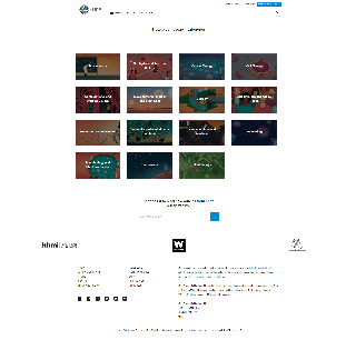
Homepage with animated "carousel" / "discovery thingy"
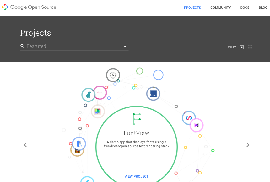
Example of an "item page" in this system | https://opensource.google.com/projects/explore/featured |
| 2017 June 7 interesting but not enthusiastic about this viewer | |
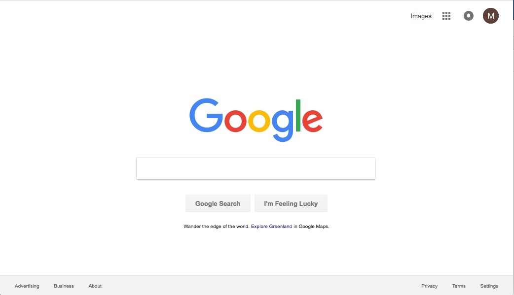
| homepage |
| https://www.google.com/?gws_rd=ssl | simple but powerful works for all types of content and repos with mixed content. Princeton has for example no pretty images, lots of journal articles, ETDs, some datasets, ... low maintenance: no manual grooming of featured items - no worries that arithmetically chosen featured items step on anybodies feelings this will live and die with the SEARCH and Filter capabilities on the search results page
| 2017 June 7 would be a very good customizable option | |
| homepage |  | https://resonance.is/ |
| 2017 June 7 like how it highlights new items like as an option, but not a default would like it customizable | |
| item listing |  | https://resonance.is/research-publications/ |
| 2017 June 7 would like display of the pdf as a customizable option for collections and search results takes up a lot of the screen, reducing space for side bars | |
| item listing |
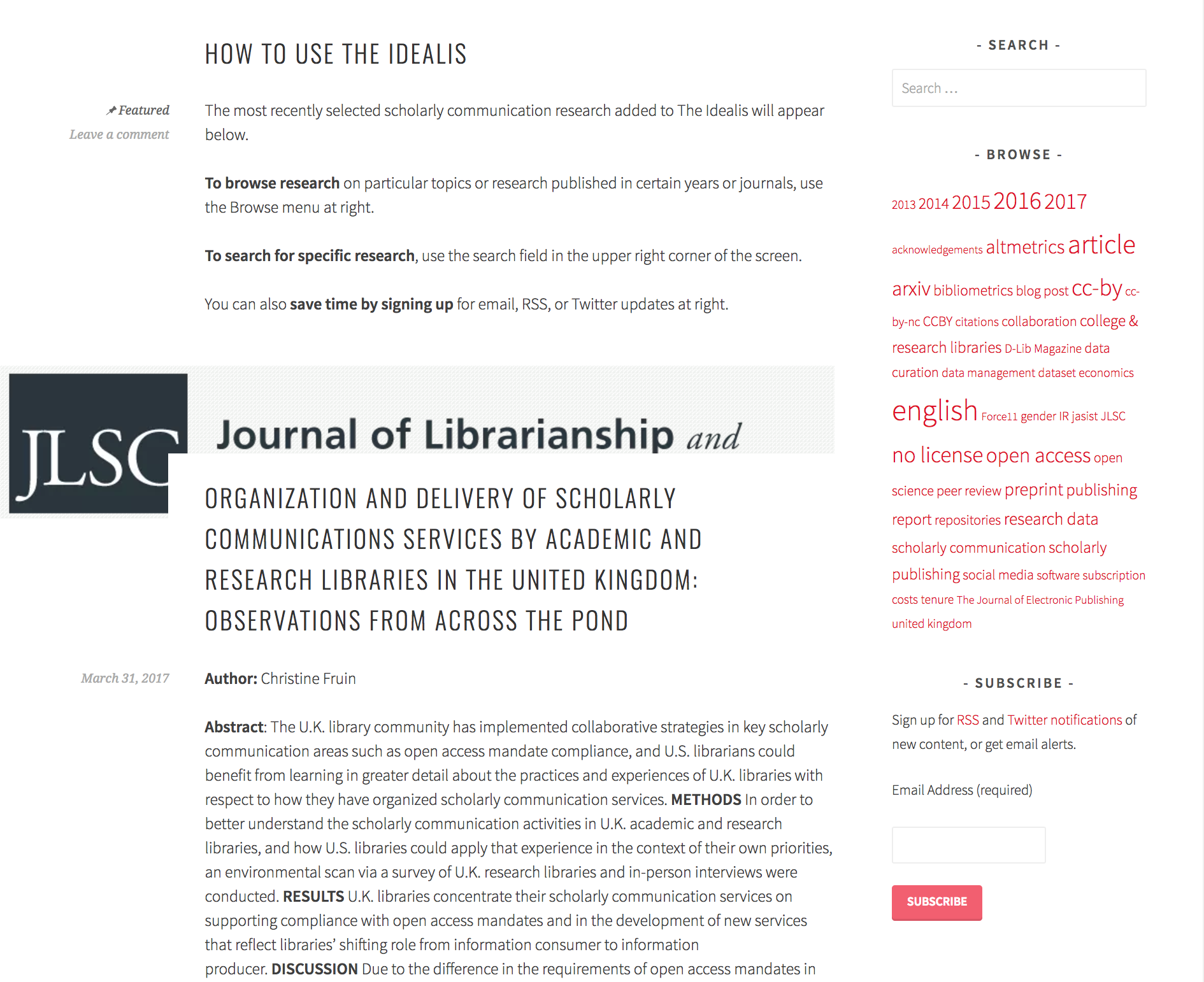
| https://theidealis.org/discover/ |
| 2017 June 7 busy | |
| search results |  | Semantic Scholar search result list |
| ||
| item page |  | Semantic Scholar Item page | So much awesomeness don't know where to begin | ||
| author profile | 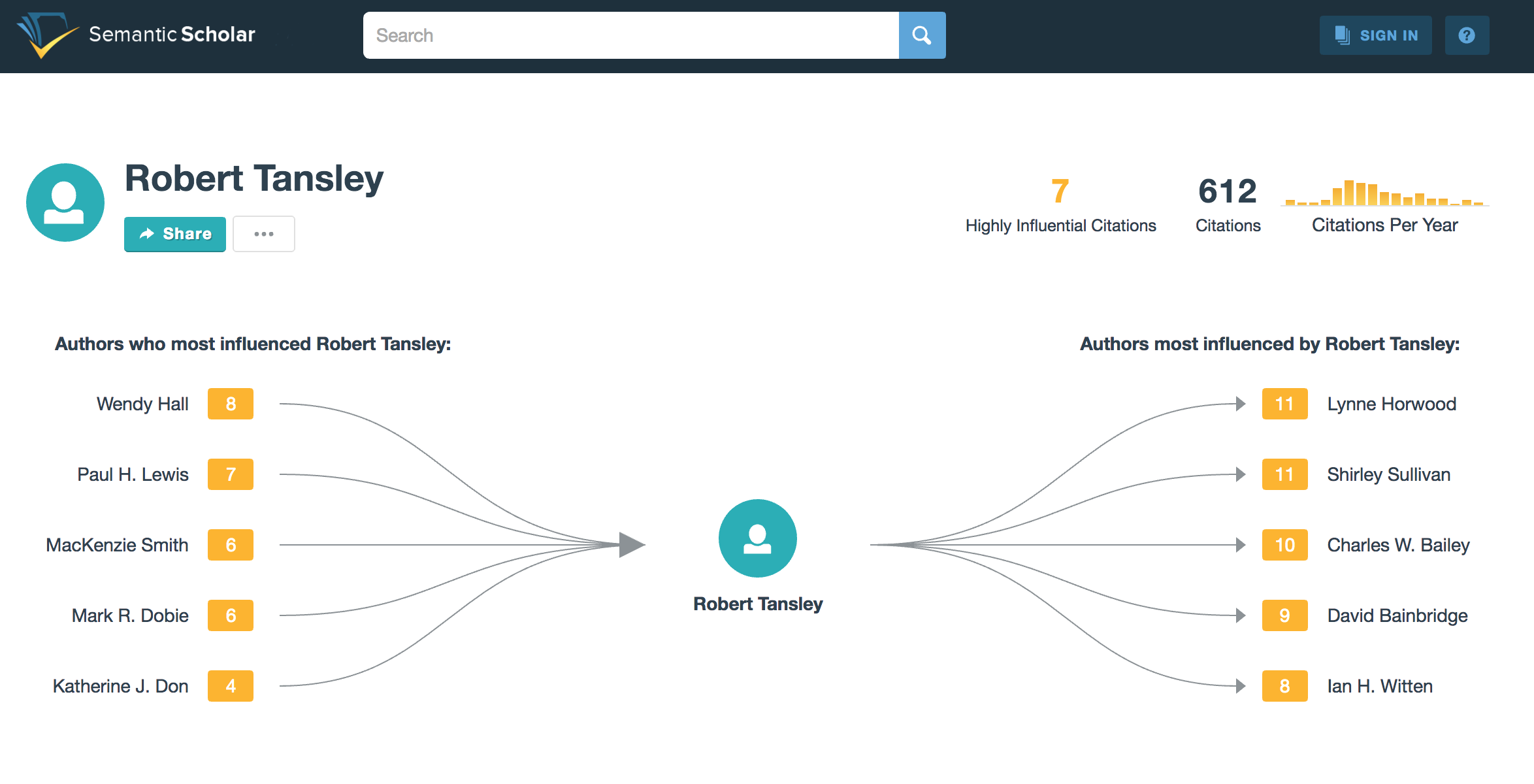 | Semantic Scholar author profile | So much awesomeness don't know where to begin | ||
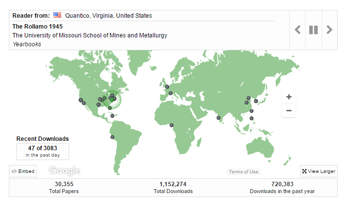
| Felicity Dykas (Missouri) | Home page |
| Digital Commons at Missouri University of Science and Technology | Dynamic map; dots appear to show items being downloaded. Eye-catching. Shows users (and administrators) that this is a site that is being used. "This map shows recent readership activitiy ..." | 2017 June 7 homepage should be simple; useful to have option to add to selected pages; e.g., statistics view; make available for repository, community, collection, and items nice, interactive feature shows records being accessed would be of interest to faculty |
| Felicity Dykas (Missouri) | Home page |
| https://dl.mospace.umsystem.edu/umsl/ Islandora at University of Missouri–St. Louis | Slide show - as an option feature. Knowledge Bank at OSU has this feature: https://kb.osu.edu/dspace/ | 2017 June 6 Would like homepage design options that add appealing visuals |
| Felicity Dykas (Missouri) | Search results |
| https://ir.uwf.edu/islandora/search/education?type=dismax U of West Florida | Different options for viewing search results:
Users get to choose; plus manager can set default. I like how the metadata is displayed in the List view. Clearly labeled and simple. | 2017 June 6 Like ability to offer users different view options: condensed/expanded, and the options here Not sure if users use such options |
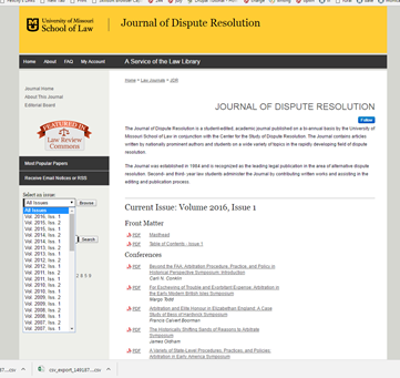
| Felicity Dykas (Missouri) | Item page or journal collection page |
| http://scholarship.law.missouri.edu/jdr/ Digital Commons at University of Missouri Law School | Like the drop down box from which users can choose an issue. Once an issue is chosen, the pdfs are organized under categories - which vary from issue to issue Examples:
| |
| Arthur Smith | Research categories (community/collection view?) |
| https://elifesciences.org/subjects | Simple categories, visually easy to browse. | |
| Homepage |
| https://estudogeral.sib.uc.pt/ | Focus on institucional Repository context Image highlight, general stats, last deposits, administrative information regarding the repository use | ||
| Homepage |
| http://ubibliorum.ubi.pt/ | Institutional repository with banner slideshow of the institution + action buttons to deposit, login,.. + information regarding policy, helpdesk... | ||
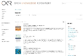
| Jose Carvalho | Search results |
| https://openknowledge.worldbank.org/discover | Simple and clean with the possibility to refine search | |
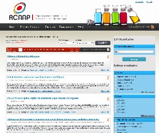
| Search results |
| https://www.rcaap.pt/ (search for "DSpace") | List of items with preview of abstract, type of access, date... + possibility to filter results |


Overview
Content Tools
All content on the LYRASIS Wiki is licensed under the CC BY (Attribution) license![]() , unless otherwise noted.
, unless otherwise noted.