You are viewing an old version of this page. View the current version.
Compare with Current
View Page History
« Previous
Version 9
Next »
The DSpace 7 UI Outreach Group is collecting screen shot examples of inspirational UI design and functionality for homepage design, search design, browse/content discovery design and item pages as a resource for development of the DSpace 7 UI.
| Contributor | section | screen shot | url | annotation |
|---|
| homepage
search
browse/discovery
item pages | 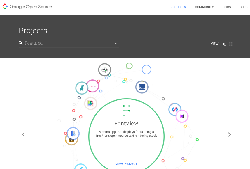
Homepage with animated "carousel" / "discovery thingy"
Example of an "item page" in this system
| https://opensource.google.com/projects/explore/featured | - Visually eye catching section that draws the user to recent/highlighted content
- In a DSpace context, this could be the thumbnails of recent items, or highlighted items/collections
- Search box that could also function to show the user the (top level) communities. The fact that the box does search "everywhere" by default, but allows you to drill down to a particular topic/community is very nice
- The SEARCH feature & listing of search results seems TOO LIGHT. Only sorting between relevance and name. No facets. I'm convinced we still need facets in DSpace search. Although there's something to say for simplicity as well.
- The item page equivalent seems a little "light". It's interesting that you lose all context of navigation, no breadcrumb etc. User is supposed to use the back button? It's very clean, but maybe too clean (e.g. sacrificing usability?)
- The fact that a single item can have its own header to make it more visual is really nice.
|
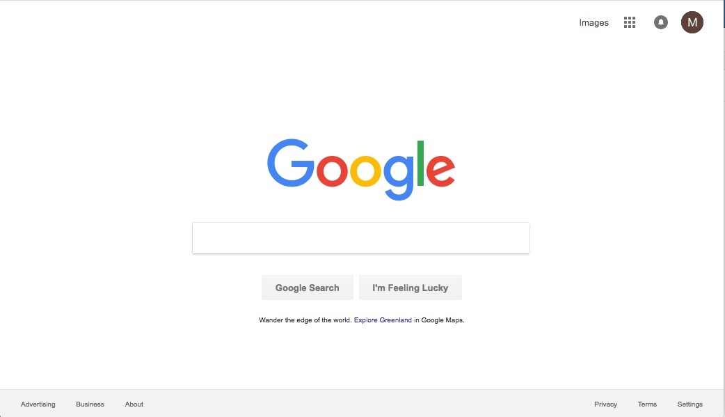
| homepage | | https://www.google.com/?gws_rd=ssl | simple but powerful |
| homepage
|  | https://resonance.is/ | - CONTENT FIRST
- Left panel: emphasis on recent/highlighted items.
- Right panel: collections/communities/subjects
- BELOW: explanation about the system/repository
- NO SIDEBAR/Clutter left or right
- Focus on social in the top level bar
|
| item listing |  | https://resonance.is/research-publications/ | - Great on mobile
- Title, citation, abstract and PDF icon
- Nothing screams "download me" more than a PDF icon
|
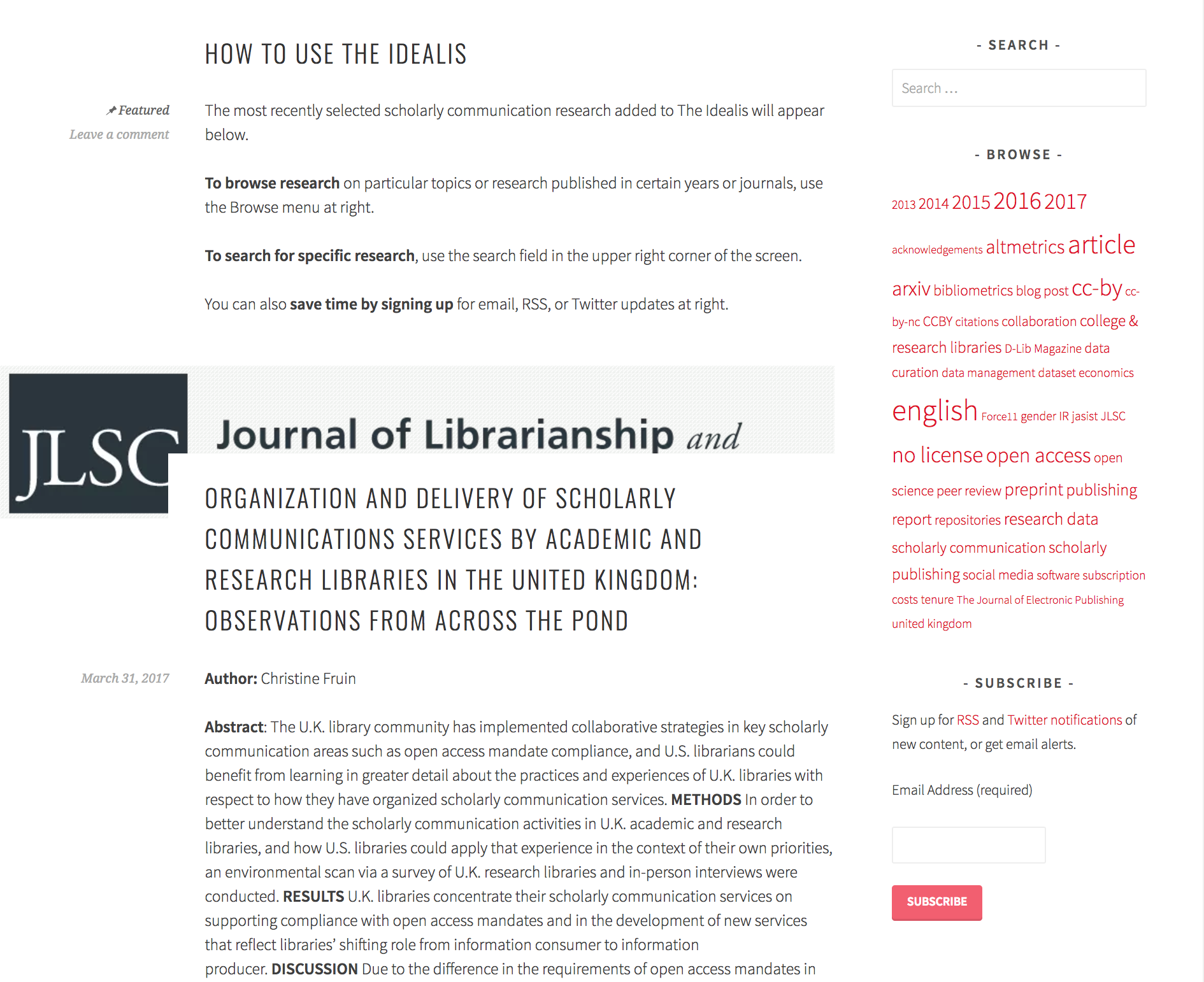
| item listing | | https://theidealis.org/discover/ | - If you need +10% of your vertical space to explain how the interface works, is it a good interface?
- Discovery aids are limited to a search box and a tag cloud
- Each item in the list has an extensive listing, with room for an image/banner per paper.
- Titel, Author, Abstract, Date, Citation and view link to the publisher page are the key metadata being shown.
|
| search results |  | Semantic Scholar search result list | - Facets fold in. Nice approach to ensure that the list of facets doesn't become too long
- Publication year slider with horizontal bar visualisation of how many results are available per year.
|