Contribute to the DSpace Development Fund
The newly established DSpace Development Fund supports the development of new features prioritized by DSpace Governance. For a list of planned features see the fund wiki page.
The DSpace 7 UI Outreach Group is collecting screen shot examples of inspirational UI design and functionality for homepage design, search design, browse/content discovery design and item pages as a resource for development of the DSpace 7 UI.
| Contributor | section | screen shot | url | annotation |
|---|---|---|---|---|
| homepage search browse/discovery item pages |
Homepage with animated "carousel" / "discovery thingy"
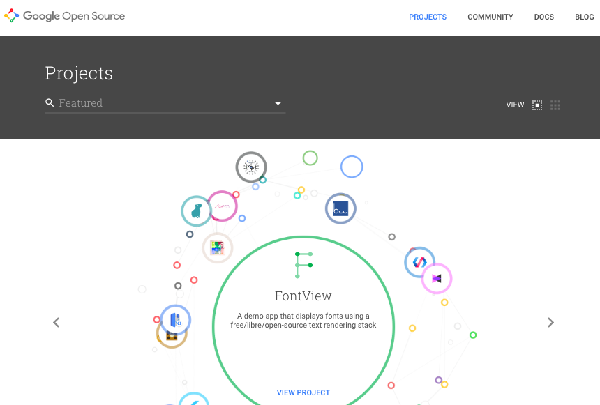
Example of an "item page" in this system | https://opensource.google.com/projects/explore/featured |
| |
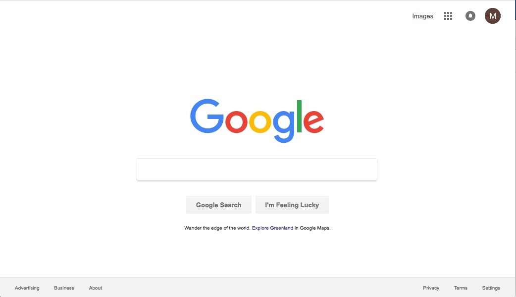
| homepage |
| https://www.google.com/?gws_rd=ssl | simple but powerful | |
Overview
Content Tools
All content on the LYRASIS Wiki is licensed under the CC BY (Attribution) license![]() , unless otherwise noted.
, unless otherwise noted.