DSpace-CRIS allows to manage the visualization and access to the item data in a more fine-grain way than the default DSpace.
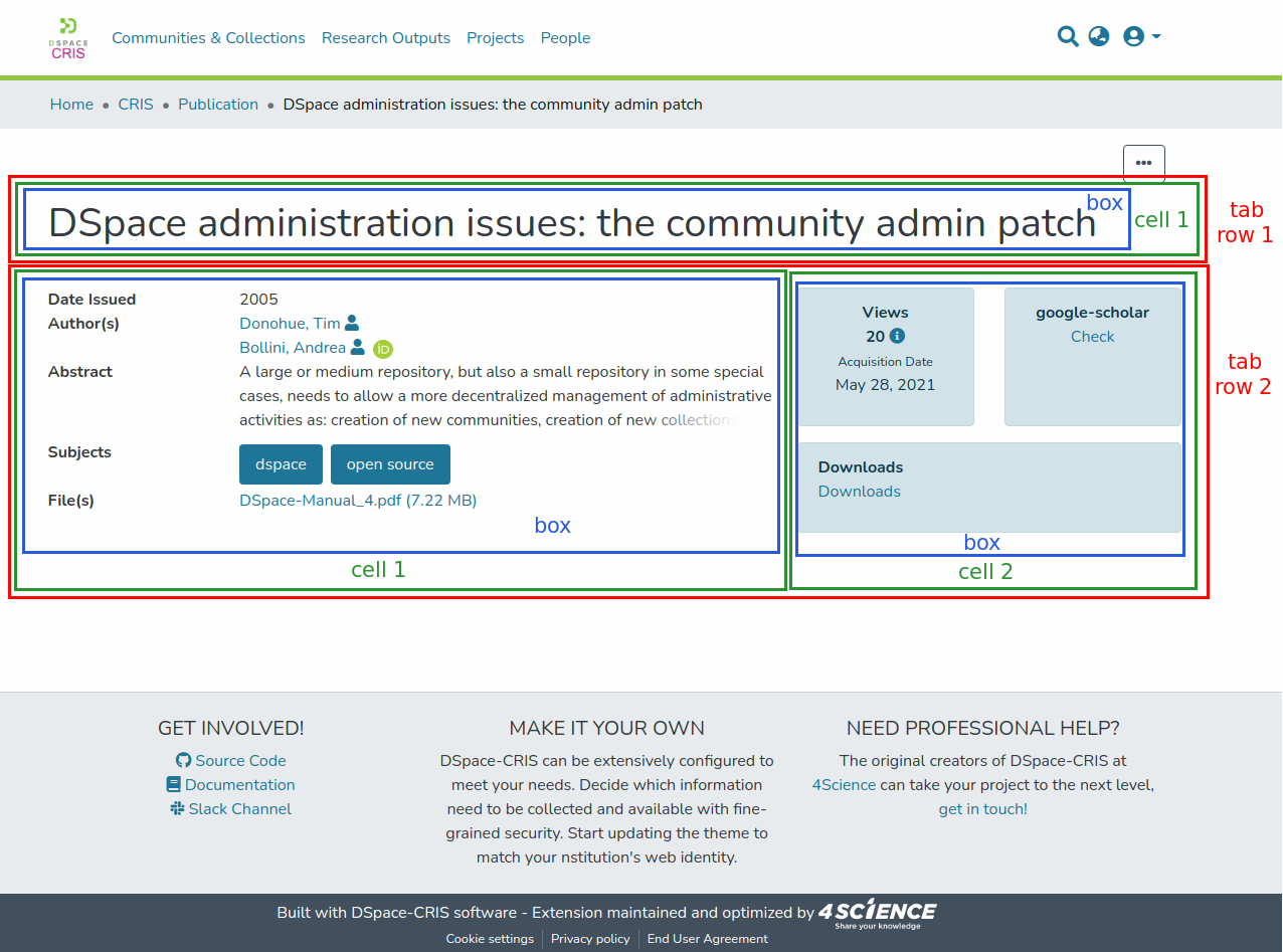
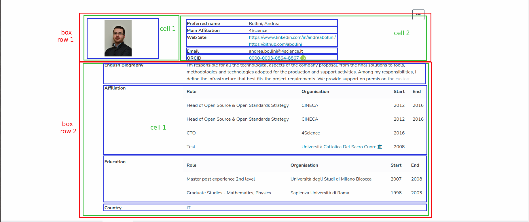
Continuing in the wake of the previous DSpace-CRIS versions the item information is organized over two levels, tabs and boxes. Each tab can contain one or more boxes organized in a sort of grid composed by rows and cells. The same box can be eventually shared between multiple tabs with a specific order in each tab. A box represents the minimal unit of information about an item that can be visualized and protected.
This page explains the main concepts from the prospective of the REST API and Angular UI. To get details about how to configure the layout and the security via the excel file take a look at Layout and data security configuration tool page.
Vertical and horizontal Layout
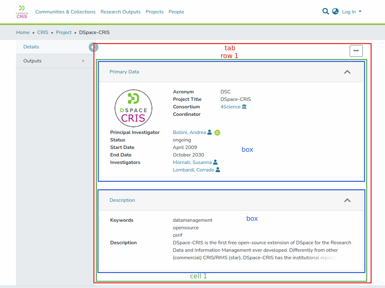
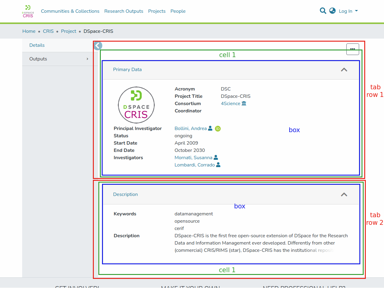
Unlike previous versions, however, it is now possible to have a main leading tab always visible and to organize the remaining tabs with a layout having two different orientations : vertical and horizontal. In the horizontal layout the tabs are arranged inside a top navbar, while in the vertical one they are arranged within a lateral sidebar.
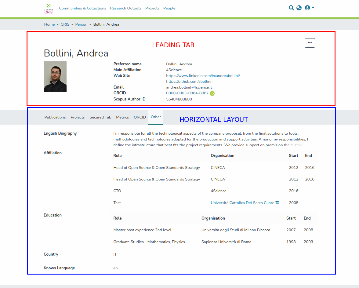
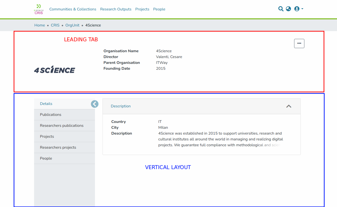
If the leading tab is not set only the chosen layout is displayed.
Only tabs and boxes that contain data visible to the current user are listed. If a tab only contains boxes without visible data or that are flagged as minor, such tab is not listed at all.
In both vertical and horizontal layout when only one tab is available sidebar and navbar are not displayed.
It’s possible to use one of the two layout (vertical or horizontal) differently depending on the type of entity. To select the layout, the DSpace angular application provide an itemPage settings under the cris-layout property in the environment file (src/environments/environment.common.ts), e.g.:
    itemPage: {
      Person: {
          orientation: 'horizontal'
      },
      default: {
          orientation: 'vertical'
      },
    },
The previous snippet configures an horizontal layout for the entity type Person, while using the vertical one by default for all other entities type. It’s possible to specify no entity type, in this case the default value is used for all entities.
Tab grid system
In order to have a more flexible way to arrange boxes within, a tab a new grid system is used. The grid system uses a series of rows and cells to layout and align boxes, following these rules :
Every row can contains one or more cells
Every cell can contain one or more boxes
All cells inside the same row are displayed one next to the other
All boxes inside the same cell are displayed one below the other
Here are some practical examples:
The same result can also be achieved in a different way:
This page explains the main concepts from the prospective of the REST API and Angular UI. To get details about how to configure the layout and the security via the excel file take a look at Layout and data security configuration page.
The tabs are represented by the org.dspace.layout.CrisLayoutTab java class and exposed in the REST layer via the org.dspace.app.rest.model.CrisLayoutTabRest. The boxes are represented by the org.dspace.layout.CrisLayoutBox java class and exposed in the REST layer via the org.dspace.app.rest.model.CrisLayoutBoxRest and org.dspace.app.rest.model.CrisLayoutBoxConfigurationRest. The later one, in particular, is the extension point to plug the different types of boxes in the platform.
The REST contract for tabs and boxes can be found here:
Rest7Contract/tabs.md at dspace-cris-7 · 4Science/Rest7Contract
Tabs and Boxes are bound to a specific Entity Type and share the following attributes:
shortname. It is an alias of the Id used to refer to the tab / box from configuration files, without the need to hardcode the database generated Id
label. It is the label, or the i18n key, to use to present the section to the user. In case you want to use the header as a translation key, the complete i18n key used by the system has the prefix
layout.tab.header.for the tab, andlayout.box.header.for the boxsecurity. It can have one of the following values:
0 → public. Everyone can access the data contained in the tab (if the security is not overridden by the box security), or box
1 → administrator. Only system administrator can access the data
2 → owner only. Only the owner of the item can access the data. Please note that the concept of item owner is specific of DSpace-CRIS and it is different from the submitter. The item owner is defined by the
dspace.object.ownermetadata3 → owner and administrator. Only the owner of the item and the system administrator can access the data
4 → custom policy. The list of people and groups that can access the data are defined in other metadata of the item itself. The metadata to use are defined in the securityMetadata attribute that contains a list of reference to metadata fields that are expected to be configured with the
EPersonAuthorityorGroupAuthority
Other than the common attributes above, the tabs have also these extra attributes:
leading. It can be true or false. If true, the tab is shown on the top of the item’s page and remains there even if the user browse the other tabs
priority. Attribute that is used to sort them in ascending order
rows. It contains the configuration of the grid used to display boxes beloging to the current tab. Each row is composed by cells that contains the list of boxes. Boxes have a specific order inside each cell that include them.
Other than the common attributes above, the boxes have also these extra attributes:
container. It can be true or false. If true, the box is show as a collapsible panel, otherwise it has no container and is always visible
collapsed. When true, and box container property is set to true, the box panle start collapsed, and the user need to open it to see the actual data
minor. It is true when the box should not be used to determine if a tab actually has content or not
style. It is added to the CSS classes of the generated html element that contains the tab or box to allow further customization via CSS
configuration. It contains additional information used to render the data in the appropriate way
Nested tabs
It’s possible to have two or more tabs grouped by the same top menu entry. In this case the tab entries are displayed with a dropdown in the sidebar and navbar:

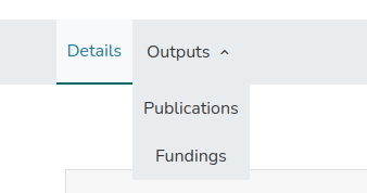
To configure the nested two or more tabs, the shortname property and label may contain the parent and child tabs concatenated by ::.
Following the previous example where we have two tabs, publications and fundigs, grouped by a the top level tab outputs , the configuration is like :
shortname | label |
|---|---|
outputs::publications | Outputs::Publications |
outputs::fundings | Outputs::Fundings |
When relating boxes to nested tab, the shortname of the tab to use must include also the top level ( e.g. outputs::publications).
Box types
Different types of boxes exist, the rest contract https://github.com/4Science/Rest7Contract/blob/main-cris/boxes-types.md details the different endpoints used by each type to expose the configuration details.
Metadata Box
The most simple and used is named METADATA. A metadata box is a collection of item metadata fields and selection criteria over the item bitstreams, organized in rows, each of which can contain one or more fields. Three types of fields exist (metadata and bitstream), their additional configuration options are exposed in an attribute with the same name than the fieldType:
METADATA. The field holds the values stored in an item metadata identified with the
<schema>.<element>[.<qualifier>]syntax that is exposed in themetadataattributeMETADATAGROUP. The field holds the values stored in a group of nested metadata identified with the
<schema>.<element>[.<qualifier>]syntax that is exposed in themetadataattributeBITSTREAM. The field holds the bitstreams in a specific item bundle optionally matching a specific value for a metadata. The
bitstreamattribute is an object containing the:bundle, the name of the bundlemetadataFieldandmetadataValue, optional, the value of a specific bitstream metadata that will be used to filter which bitstreams are included in the field. If the metadataValue start with a!the filter become negative (only return bitstreams that don’t match the criteria). It is also possible specify a regex puting the metadataValue between bracket(...regex...), or a negative regex!(...regex...)
IIIFVIEWER. The field holds an embedded Mirador viewer. This is showed only if the metadata
dspace.iiif.enabledis set to true. See IIIF Configuration#InstallingandConfiguringCantaloupe for further information about how to enable the IIIF viewer.
Regardless to the fieldType, each field has the following attributes:
label. The textual label or i18n key to use as label for the field. In case you want to use the header as a translation key, the complete i18n key used by the system has the prefix
layout.field.header.rendering. The rendering strategy for the field. Examples are heading, text, longtext, crisref, identifier, date, link etc. for metadata field, and preview, thubmnail for bitstream field
styleLabel. The style attribute allows to set arbitrary css styles to the metadata’s label
styleValue. The style attribute allows to set arbitrary css styles to the metadata’s value
labelAsHeading. If true, the metadata value is displayed below the metadata label. If false, metadata value is displayed along the metadata label


valuesInline. If true, when a metadata has multiple values, they are displayed one along the others. If false, they are displayed one below the others


Box grid system
In a very similar way to what we have for tabs, the grid system is used also to locate metadata within a metadata box. The grid system uses a series of rows and cells to layout and align metadata, following these rules:
Every row can contains one or more cells
Every cell can contain one or more metadata
All cells inside the same row are displayed one next to the other
All metadata inside the same cell are displayed one below the other
Rendering Types
DSpace CRIS provides some types of ready-to-use rendering, but it is possible to create new ones.
To show a certain field with one of the renderings listed, it is necessary to set one of the names indicated in the “rendering” property of the field.
An extensive rendering description can be found at Rendering strategies.
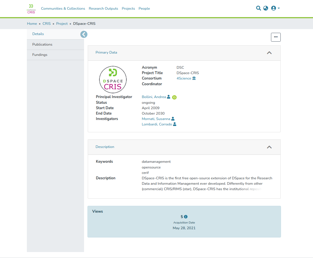
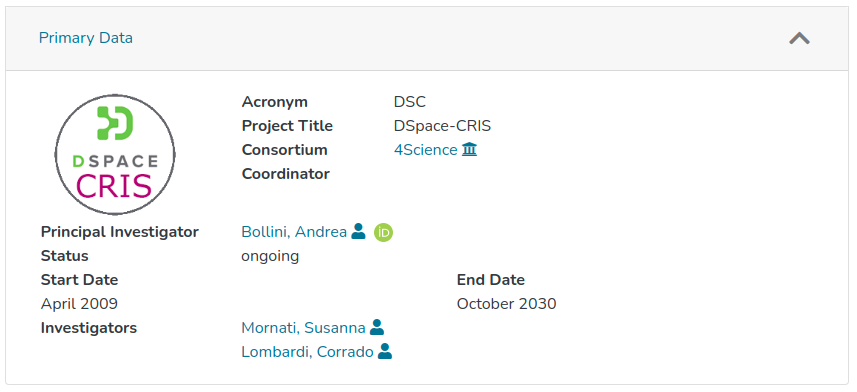
Relation Box
Out of the box another type of box named Relation Box is available. This box is bound to a DiscoveryConfiguration that can be parameterized with the uuid of the item. The defaultFilterQueries of the DiscoveryConfiguration can contains the placeholder {0} that will be replaced at runtime with the uuid of the item. Please refer to next paragraph for further details about how to set and configure such queries.
Relation Discovery Configuration
A powerful out-of-the-box box type is provided: RELATION. This box is populated with Item’s linked objects found via a Discovery query.
Discovery queries are configured via discovery.xml file (<dspace-install-dir>/config/spring/api/discovery.xml) , in org.dspace.discovery.configuration.DiscoveryConfigurationService bean. A map’s entry for each relation is provided, standard pattern for key is RELATION.<Entity>.<relationName>. Entity and relationName must match to what reported in xls file, box sheet, ‘ENTITY’ and ‘SHORTNAME’ entries for each relation. For example, RELATION.Project.researchoutputs identifies the relation that will be used to populate 'researchoutupts' box configured in excel file for entity 'Project'.
Map’s entry is a reference to a DiscoveryConfiguration instance that has to be properly configured in an ad-hoc section. In this section information about sidebar’s facets and search filters to be included in the box, results sorting, results per page, …
The core part of DiscoveryConfiguration, for relation’s set up is defaultFilterQueries. This section contains one or more filter queries to be performed, given Item’s uuid, to find linked Items. In case many filter queries are provided, such queries are executed in sequence: the second query filters first query’s results and so on.
This is the query that retrieves projects related to a person: projectinvestigators_authority:{0}, where {0} is a placeholder for UUID of the person. In case of inverse relations, queries are more complex and a subquery is needed. For exampl,e this is the query that finds Projects belonging to every person affiliated to an OrgUnit, given OrgUnit UUID: '{'!join from=search.resourceid to=projectinvestigators_authority fromIndex=search'}'person.affiliation.name_authority:{0}.
A full example of how relation that finds a Person pubblications is configured:
<bean id="relationAuthorPublicationsConfiguration" class="org.dspace.discovery.configuration.DiscoveryRelatedItemConfiguration">
    <!--Which sidebar facets are to be displayed-->
    <property name="sidebarFacets">
        <list>
            <ref bean="searchFilterAuthor" />
            <ref bean="searchFilterEntityType"/>
            <ref bean="searchFilterSubject" />
        </list>
    </property>
    <!-- Set TagCloud configuration per discovery configuration -->
    <property name="tagCloudFacetConfiguration" ref="defaultTagCloudFacetConfiguration"/>
    <!--The search filters which can be used on the discovery search page-->
    <property name="searchFilters">
        <list>
            <ref bean="searchFilterAuthor" />
            <ref bean="searchFilterEntityType"/>
            <ref bean="searchFilterSubject" />
        </list>
    </property>
    <!--The sort filters for the discovery search-->
    <property name="searchSortConfiguration">
        <bean class="org.dspace.discovery.configuration.DiscoverySortConfiguration">
            <!--<property name="defaultSort" ref="sortDateIssued"/>-->
            <!--DefaultSortOrder can either be desc or asc (desc is default)-->
            <property name="defaultSortOrder" value="desc"/>
            <property name="sortFields">
                <list>
                    <ref bean="sortTitle" />
                </list>
            </property>
        </bean>
    </property>
    <!--Any default filter queries, these filter queries will be used for all
            queries done by discovery for this configuration -->
    <property name="defaultFilterQueries">
        <list>
            <!--Only find related items. The placeholder {0} will be replaced with scope (UUID of item)-->
            <value>author_authority:{0} AND entityType_keyword:Publication</value>
        </list>
    </property>
    <!--Default result per page  -->
    <property name="defaultRpp" value="10" />
    <property name="hitHighlightingConfiguration">
        <bean class="org.dspace.discovery.configuration.DiscoveryHitHighlightingConfiguration">
            <property name="metadataFields">
                <list>
                    <bean class="org.dspace.discovery.configuration.DiscoveryHitHighlightFieldConfiguration">
                        <property name="field" value="relationship.type"/>
                        <property name="snippets" value="5"/>
                    </bean>
                </list>
            </property>
        </bean>
    </property>
</bean>
Metrics Box
The METRICS box is responsible to display metrics values for the displayed item.
When a box of type metric is detected, its configuration is fetched. The metrics box configuration simply contains an array of types of metrics that belong to the box. The order is important, because existing metrics are displayed following such order.
Then Metrics values are processed by a service method named getMatchingMetrics. It filters by types, sorts and organizes metrics in rows as defined by the box field ‘maxColumn’, which specifies how many metrics must appear in each single row.
Finally, layout components are instantiated based on the type of each metric.
The metricLoaderService keeps the mapping between metric type and component type and, occasionally, an external script that must be loaded to display the metric correctly.
For bundles sizes reasons, scripts are lazily loaded once the first time they’re needed.
Simple metrics types extend the abstract BaseMetricComponent. Metrics which require external script extend the BaseEmbeddedMetricComponent, which takes care to manage the script execution. Since the script could take time to be loaded, the baseEmbeddedMetric follows a retry strategy. This strategy can be driven through two global variables:
METRIC_SCRIPT_TIMEOUT_MS = 500;
METRIC_SCRIPT_MAX_RETRY = 3;
which specify the max number of attempts and a delay between each.
Currently 4 types of components exists:
MetricDspacecrisComponent (BaseMetricComponent)
Display a generic dspacecris metric using all the information coming from the server. This type is also the default in case no mapping with the metricType exists
Type: google-scholar
MetricGooglescholarComponent (BaseMetricComponent)
Display a Google Scholar Metric, by using the link inside the metric.remark field
Type: altmetric
MetricAltmetricComponent (BaseEmbeddedMetricComponent)
- Dyspace an Altmetrics Metric
As per metadata boxes, metric boxes are returned by the server only if content to visualize exists. At the moment possible existing metrics are visible only to logged in users, so for anonymous sessions metric boxes are always hidden.
Additional metrics boxes can be configured, for example, Scopus and WOS. After creating the Metrics box in the box sheet of the CRIS layout, the type of metric shall be defined in the box2metrics sheet. Check available types at Layout and data security configuration tool#box2metrics
Collections box
The COLLECTIONS box shows the owning collection of an item, and all mapped collections:

It is possible to customise the appearance of this box through the following properties:
crisLayout
  collectionsBox
    defaultCollectionsLabelColStyle: col-3 font-weight-bold
    defaultCollectionsValueColStyle: col-9
    isInline: true
Security of the metadata
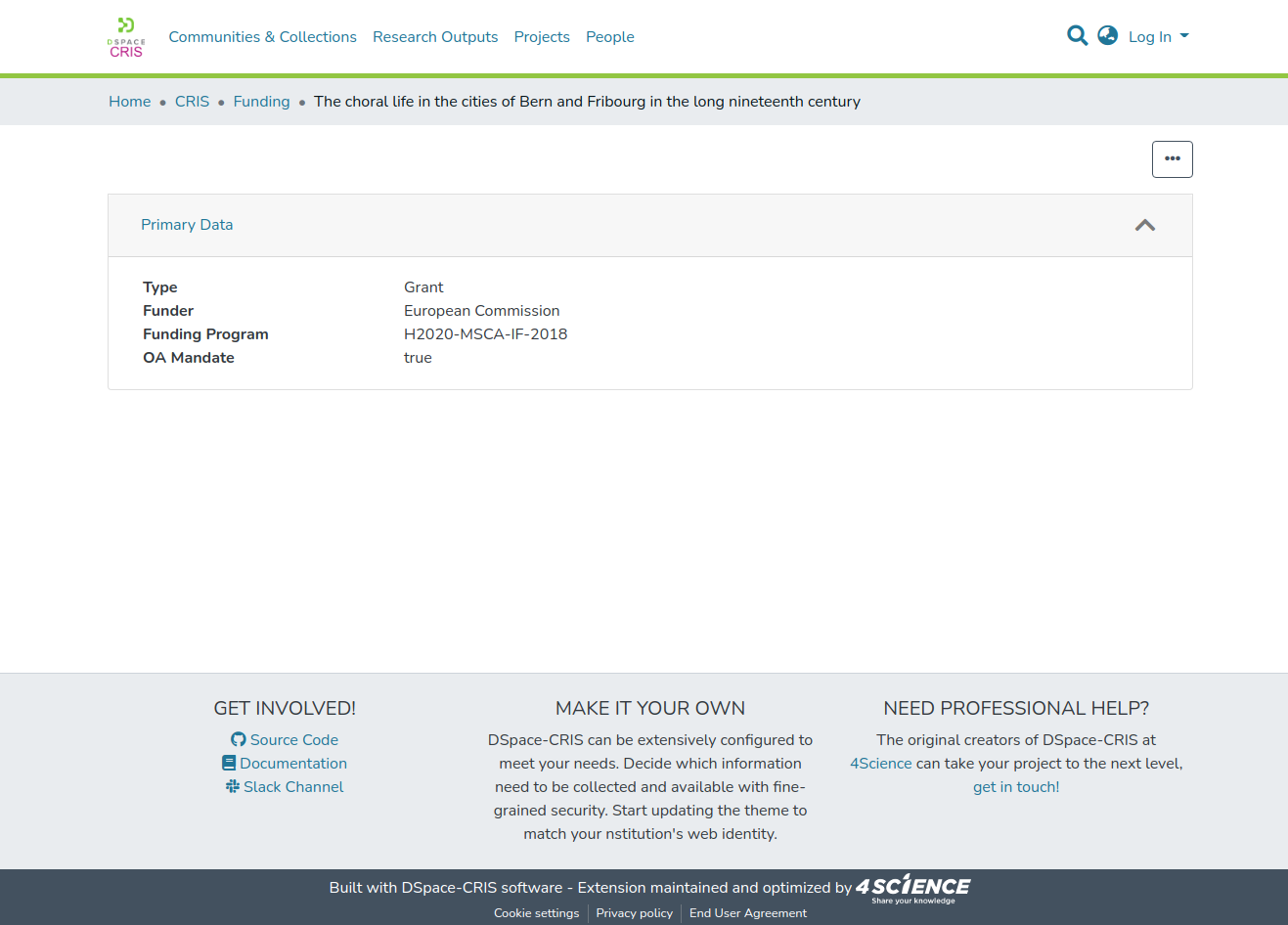
DSpace-CRIS allows a more granular control of the security. It is possible to configure which metadata are available to different users. Out of box the DSpace-CRIS behavior mimic the one implemented by DSpace, metadata are generally available to any user (anonymous) with the only exception of the metadata listed in the configuration files with the key metadata.hide.<schema>.<element>[.<qualifier>] = true
When the cris layout defines tabs or boxes that have a limited access the metadata used in these tabs / boxes are checked in details and a user will be able to retrieve them via API, so in the UI, only if the user has the right to access such metadata via at least one box. This mean that metadata not used in the cris layout are generally public but can still be restricted to the administrators using the metadata.hide. configuration keys.
A special project named preventMetadataSecurity exists to skip the evaluation of the granular security logic where appropriate. This is the case when a large number of items are retrieved to show just a limited amount of data that are known to be not controversial. Indeed, if the client specify this projection in the REST request only the metadata listed under the configuration key metadata.publicField are returned without wasting time in further check . This mean that using such projection also authorized users are unable to retrieve potential sensible data.
DSpace-CRIS goes a step further and other than providing a granular security at the level of individual metadata field it is also able to define a further access rule to decide which individual metadata values are visible to a specific user.
This is configured in the metadata-security.cfg file where this feature can be enabled for all the metadata or a specific subset, defining the default configuration (usually no further restriction as in a basic DSpace) for metadata that are not explicitly mentioned. The exact meaning of the different metadata value security level is defined in the spring-dspace-security-metadata.xml file and by default offer
level 0: everyone (that is granted to see the metadata field)
level 1: member of the group “Trusted” (can be configured)
level 2: administrators.
Customize the default items layout
In DSpace-CRIS 7 the default layout for displaying items can be overwritten with customized Angular components.
To make the layout customization flexible, it is possible to overwrite the layout in different levels:
Customization of the layout by overwriting style
Overwriting a specific box
Defining a new field rendering type
Within the dspace-angular project, there is the CrisLayoutModule module under the path src/app/cris-layout, which is responsible for managing the layout of the items.
Customization of the layout by overwriting style
The most important properties of the new layout have CSS variables that can be changed, or overwritten in case you’re using your custom DSpace theme.
All the variables are available in the file src/styles/_custom_variables.scss (all the ones that start with the prefix --ds-cris-layout) and allow to change color, width or height of some layout’s elements.
Customization of a specific box
All the components used for rendering a specific type of boxes are collected in the folder src/app/cris-layout/cris-layout-matrix/cris-layout-box-container/boxes
Every type of box has in common a component container (src/app/cris-layout/cris-layout-matrix/cris-layout-box-container/cris-layout-box-container.component.ts) that has the aim of rendering the box within a collapsible accordion.
So it is possible to customize cris-layout-box-container.component.ts in order to change the container for all the boxes, or to customize only a specific type of boxes. To deal with it, every box components are using the @RenderCrisLayoutBoxFor decorator, that has two params :
boxType: that defines for wich type of box the component is usedhasOwnContainer: that defines if the box should use the common container or its own one
This level of customization will allow to overwrite, for example, the section like in the following image:
Defining a new field rendering type
To define a new field rendering the following steps are needed:
add the new rendering type into the enumeration
FieldRenderingType(contained insrc/app/cris-layout/cris-layout-matrix/cris-layout-box-container/boxes/metadata/rendering-types/metadata-box.decorator.ts)create new component uder the path
src/app/cris-layout/cris-layout-matrix/cris-layout-box-container/boxes/metadata/rendering-typesextend the
RenderingTypeValueModelComponentobject (present insrc/app/cris-layout/cris-layout-matrix/cris-layout-box-container/boxes/metadata/rendering-types) in case the new rendering should handle only one matadata value per timeextend the
RenderingTypeStructuredModelComponentobject (present insrc/app/cris-layout/cris-layout-matrix/cris-layout-box-container/boxes/metadata/rendering-types) in case the new rendering should handle all the matadata values per timeadd the decorator
@MetadataBoxFieldRendering(FieldRendetingType.NEW_RENDERING_TYPE)(contained insrc/app/cris-layout/cris-layout-matrix/cris-layout-box-container/boxes/metadata/rendering-types/metadata-box.decorator.ts)add the new component created to the
ENTRY_COMPONENTSpresent in thesrc/app/cris-layout/cris-layout.module.ts
The new component will inherit the box, item , field and metadataValue (only when extending RenderingTypeValueModelComponentobject ) variables, valorized with the information of item to display and the current field, respectively.
Update the Tab/Box content
The content of a tab is normally updated on navigation events. Sometimes it could be necessary to update the content from within a tab/box when specific events occurs. This can be achieved via code calling specific event emitters on the abstract components CrisLayoutTabModelComponent and CrisLayoutBoxModelComponent.
refreshBox must be used to reload a single box content.
refreshTab must be used to reload the entire opened tab.