Contribute to the DSpace Development Fund
The newly established DSpace Development Fund supports the development of new features prioritized by DSpace Governance. For a list of planned features see the fund wiki page.
To contribute to the improvement of the default DSpace 7 theme, 4Science has created this page to share and show the work needed in terms of design and information architecture requirements. In particular our work will be focused on :
- provide a general proposal for the default DSpace 7 default theme
- provide proposals to better present DSpace 7 key pages :
- item page (default, publication, person, project, orgunit, journal)
- community page
- collection page
- search page
- standardize the different functionalities of dspace in order to use the same approach in the use of the various UI components – e.g., menus, buttons, colors
finalize different proposals for visualize and include other information/components in the home page such as:
facets (including the option to use a facet as big count - such as the entity types or the dc.type)
tag
all the components should be easily enabled or disabled to allow the institution to keep the ones that make more sense for its repository
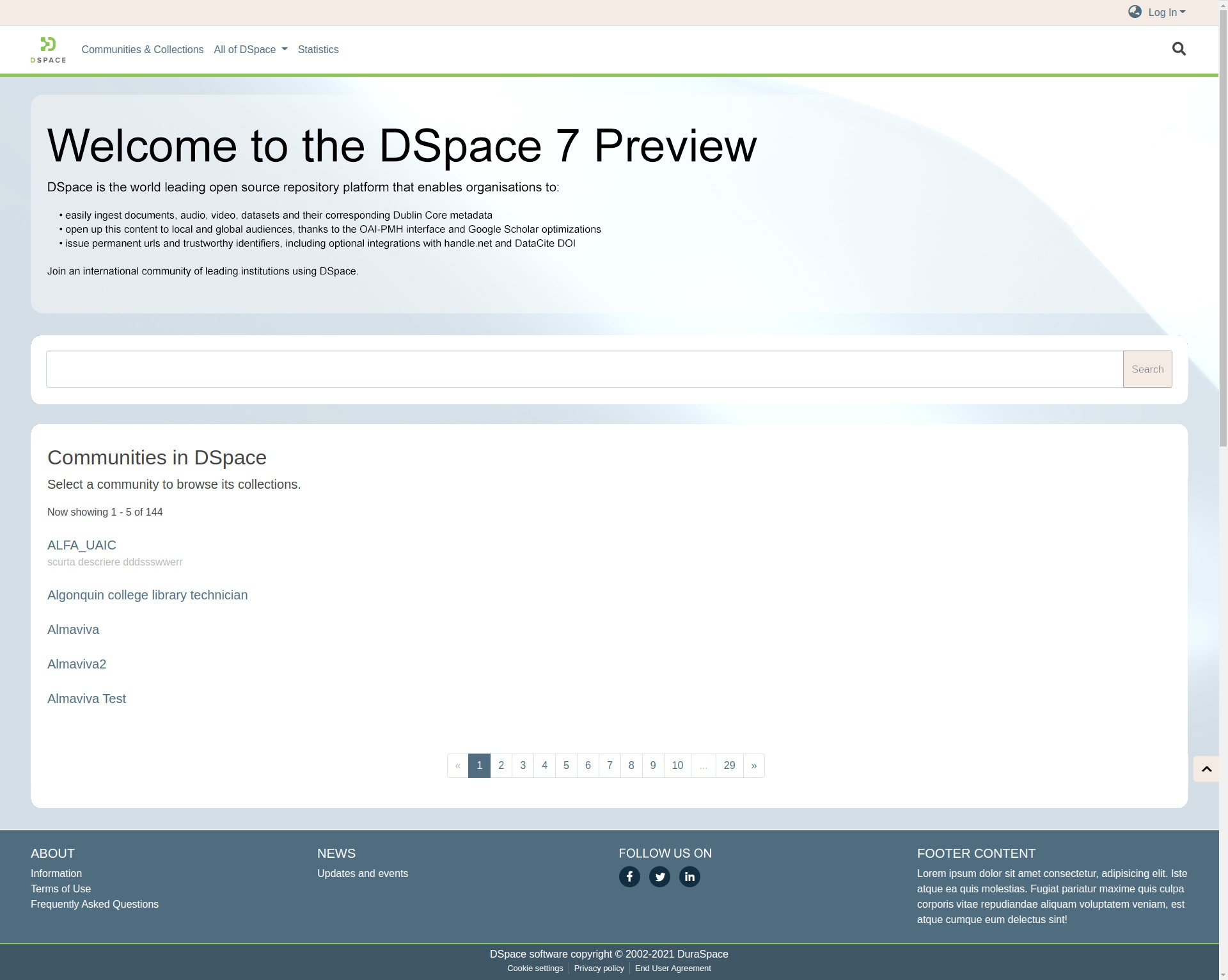
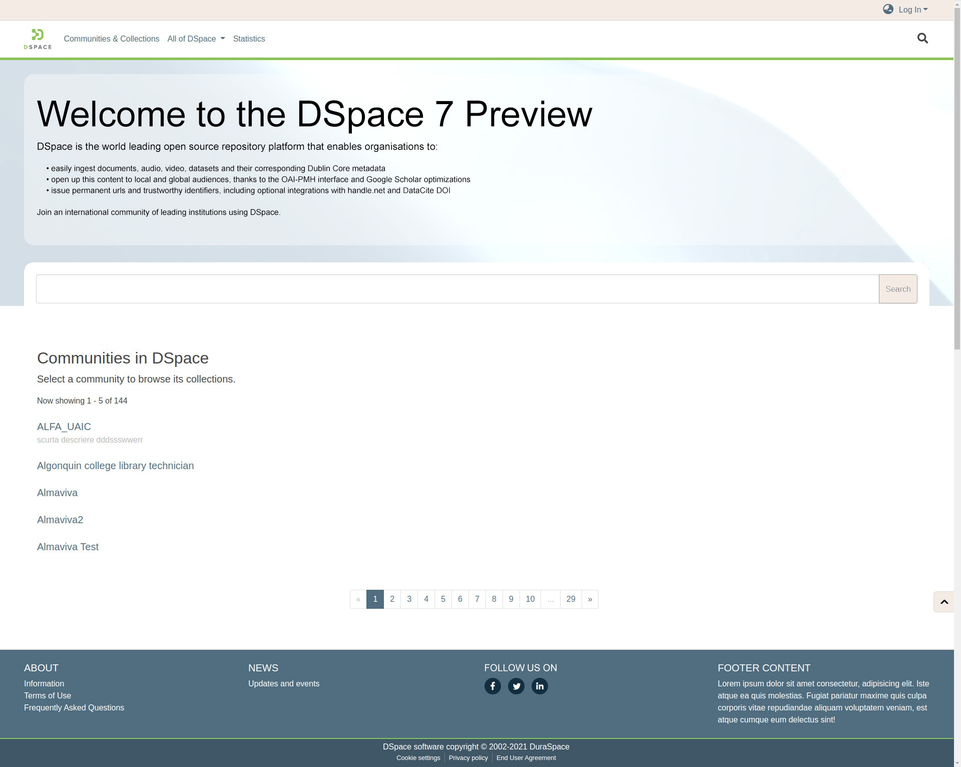
General theme proposal
Here two similar examples for the DSpace 7 home page using the new proposed theme
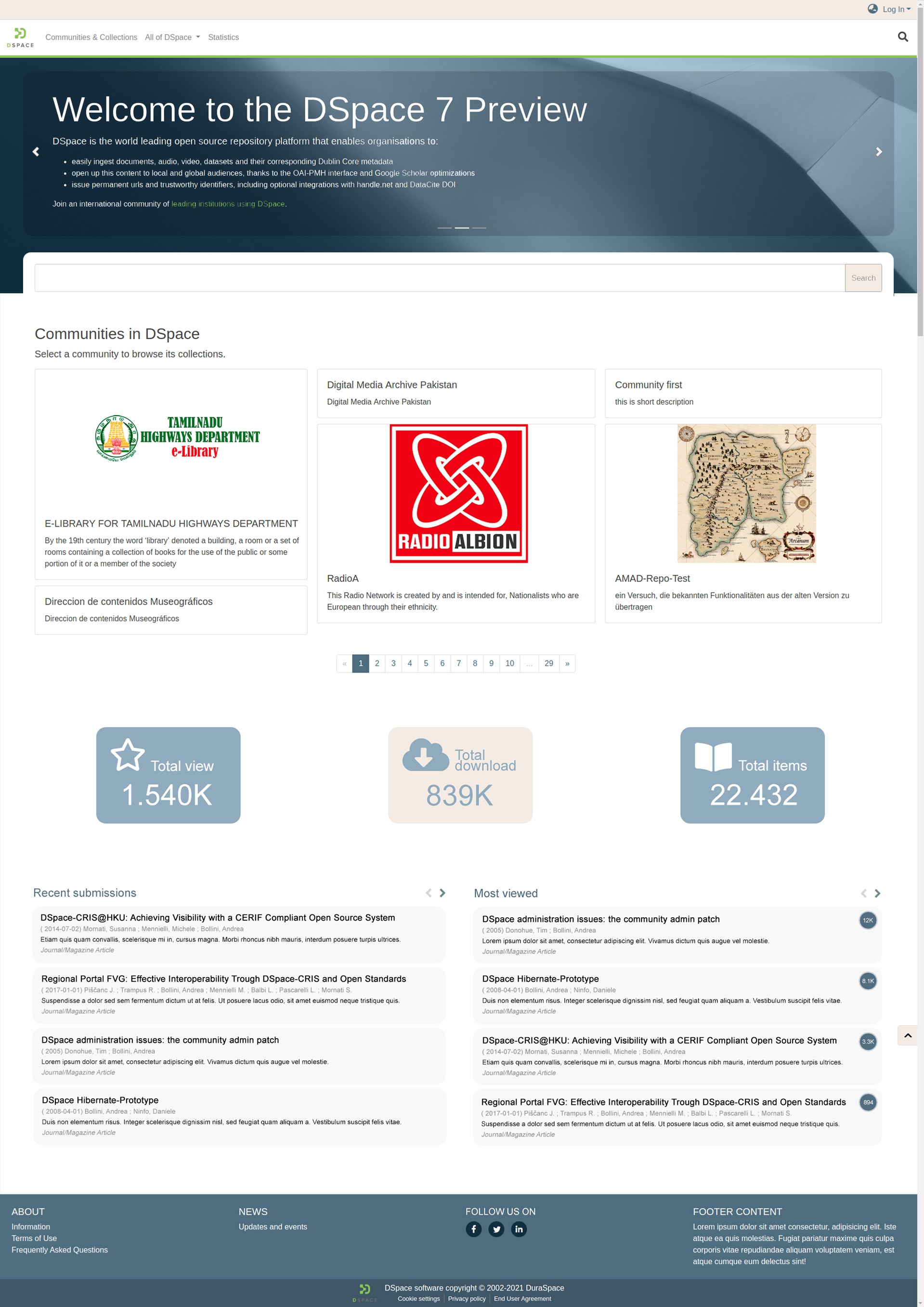
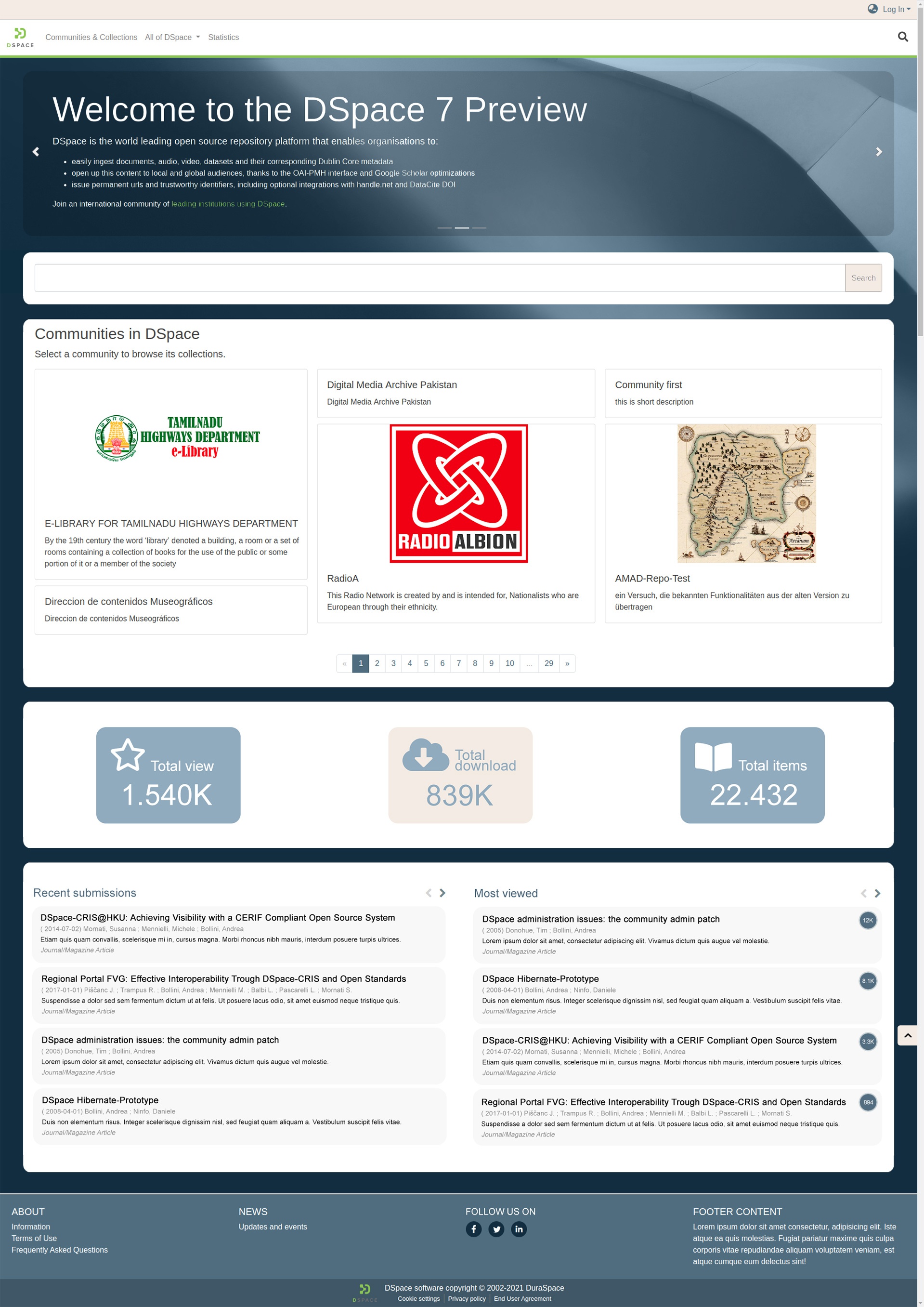
The idea is to allow the institution to show more information about the repository, for this reason we have :
- added some boxes to highlight some statistics like views, downloads and items
- thought of a carousel to scroll through the news
- thought of show the top communities in a more appealing way
- added two widgets to show the recent submissions and the most viewed
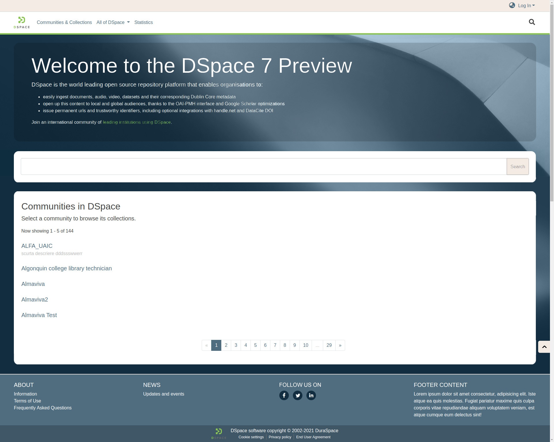
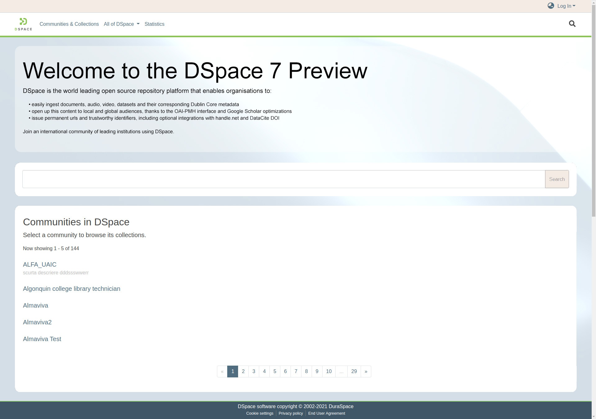
Here an example of the home page without new components
Here some examples of a theme using a lighter color :
Here some examples using a footer without any additional components :

Here an example of how the item page could appear
Here an example of how the Person item page could appear
Here an example of how the Journal item page could appear

Compare to Preview Release's "Mantis" theme

Overview
Content Tools
All content on the LYRASIS Wiki is licensed under the CC BY (Attribution) license![]() , unless otherwise noted.
, unless otherwise noted.
4 Comments
Tim Donohue
Giuseppe Digilio (4Science) and Andrea Bollini (4Science) : While I very much appreciate the designs/ideas here, I'd like to make a simple recommendation that the current DSpace 7 "default theme" should only show features that are currently available. So, while this design could be a nice "end goal", I'm not sure it's achievable in 7.0 (but it could be achievable in 7.1 or 7.2) as there are some features shown here that we've not yet built – things like the ability to have several "news" sections (in a carousel), or the new links/information implied by the new footer.
Simply put, I'd like to ensure we are not adding anything that requires new/additional REST API endpoints. I'd also like to ensure the scope of this design is not expanded well beyond the current estimates...as I think everyone is aware, we'd like to get 7.0 out the door sooner rather than later, even if it means simplifying the design in 7.0 and improving it further in 7.1 and 7.2.
Andrea Bollini (4Science)
Hi Tim Donohue we absolutely agree, we don’t expect to develop new features or REST endpoints, moreover the single visualization could be postponed or withdrawn if found to be too costly.
The main concepts behind our proposal is to
Paulo Graça
Overall I like the general ideas, but in my opinion, I think the chosen background and color gives an heavy look, and focus our attention on it. I would prefer a light grey, or any light other color that doesn't grab our attention. Perhaps an UI expert can take a look on it.
Giuseppe Digilio (4Science)
Thanks for your feedback Paulo, we provided some examples using a lighter color. Please let us know what you think about it