Page History
...
The DSpace 7 UI Outreach Group is collecting screen shot examples of inspirational UI design and functionality for homepage design, search design, browse/content discovery design and item pagesfor the different pages of DSpace as a resource for development of the DSpace 7 UI.
Homepage
...
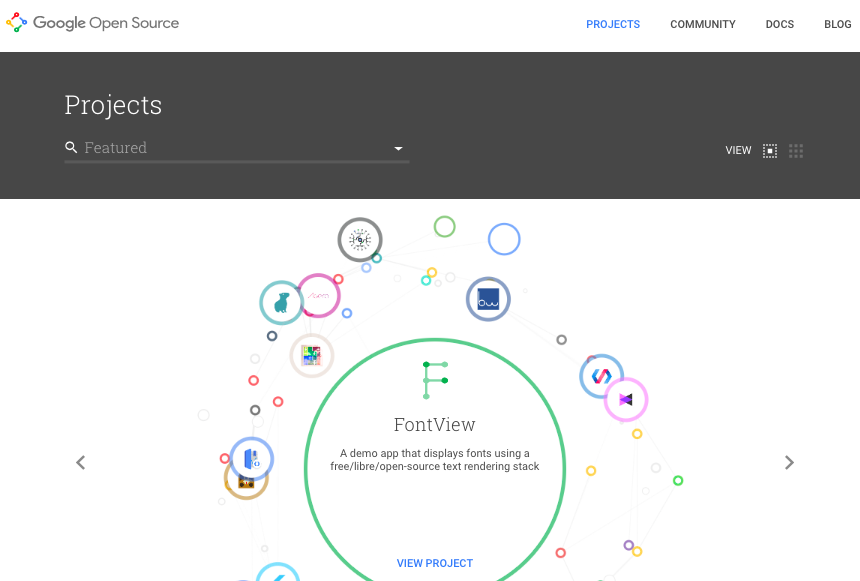
Homepage with animated "carousel" / "discovery thingy"
...
- Visually eye catching section that draws the user to recent/highlighted content
- In a DSpace context, this could be the thumbnails of recent items, or highlighted items/collections
- In a DSpace context, this could be the thumbnails of recent items, or highlighted items/collections
- Search box that could also function to show the user the (top level) communities. The fact that the box does search "everywhere" by default, but allows you to drill down to a particular topic/community is very nice
- The SEARCH feature & listing of search results seems TOO LIGHT. Only sorting between relevance and name. No facets. I'm convinced we still need facets in DSpace search. Although there's something to say for simplicity as well.
...
2017 June 7
interesting but not enthusiastic about this viewer
...
...
...
simple but powerful
works for all types of content and repos with mixed content. Princeton has for example no pretty images, lots of journal articles, ETDs, some datasets, ...
low maintenance: no manual grooming of featured items - no worries that arithmetically chosen featured items step on anybodies feelings
this will live and die with the SEARCH and Filter capabilities on the search results page
- SEARCH could lead to a page that shows a list of results and offers categories to filter results; categories should be configurable: eg
- DataSet → show only dc.type = DataSet matches
- Department → show local.custom.department facet to select one or more choices
- in terms of filtering: draw inspiration from what Blacklight does - or look at WOS search page or ....
- the grid up top could lead to a hamburger style menu - collections, submission instructions, news, statistics, ....
- top right Login or User Logo
...
2017 June 7
would be a very good customizable option
...
...
- CONTENT FIRST
- Left panel: emphasis on recent/highlighted items.
- Right panel: collections/communities/subjects
- BELOW: explanation about the system/repository
- NO SIDEBAR/Clutter left or right
- Focus on social in the top level bar
2017 June 7
like how it highlights new items
like as an option, but not a default
would like it customizable
...
...
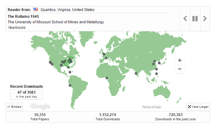
Digital Commons at Missouri University of Science and Technology
Dynamic map; dots appear to show items being downloaded. Eye-catching. Shows users (and administrators) that this is a site that is being used.
"This map shows recent readership activitiy ..."
2017 June 7
homepage should be simple; useful to have option to add to selected pages; e.g., statistics view; make available for repository, community, collection, and items
nice, interactive feature
shows records being accessed
would be of interest to faculty
...

https://dl.mospace.umsystem.edu/umsl/
Islandora at University of Missouri–St. Louis
Slide show - as an option feature.
Knowledge Bank at OSU has this feature: https://kb.osu.edu/dspace/
...
2017 June 6
Would like homepage design options that add appealing visuals
...
...

...
Focus on institucional Repository context
Image highlight, general stats, last deposits, administrative information regarding the repository use
...
...

...
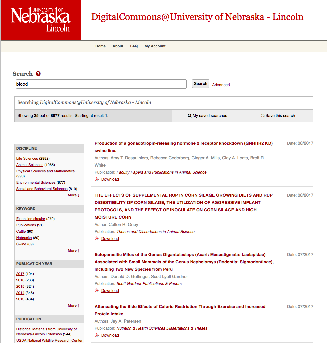
Item Listing & Search Results Page
...
...
- Great on mobile
- Title, citation, abstract and PDF icon
- Nothing screams "download me" more than a PDF icon
...
2017 June 7
would like display of the pdf as a customizable option for collections and search results
takes up a lot of the screen, reducing space for side bars
...
...
...
LIKE
- Each item in the list has an extensive listing, with room for an image/banner per paper.
DISLIKE
- If you need +10% of your vertical space to explain how the interface works, is it a good interface?
- Discovery aids are limited to a search box and a tag cloud
NOT SURE
- Titel, Author, Abstract, Date, Citation and view link to the publisher page are the key metadata being shown.
2017 June 7
busy
...
...
- Facets fold in. Nice approach to ensure that the list of facets doesn't become too long
- Publication year slider with horizontal bar visualisation of how many results are available per year.
...
...
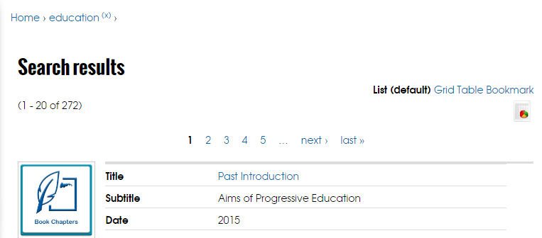
https://ir.uwf.edu/islandora/search/education?type=dismax
U of West Florida
...
Different options for viewing search results:
- List
- Grid
- Table
Users get to choose; plus manager can set default.
I like how the metadata is displayed in the List view. Clearly labeled and simple.
2017 June 6
Like ability to offer users different view options: condensed/expanded, and the options here
Not sure if users use such options
...
...
...
...
...
...
LIKE
- bibliography export option
DISLIKE
- the UI design in general
...
...
LIKE
- direct file downloads from search results
- facet values limited to 5
DISLIKE
- Not responsive
- "Publication" field => not sure if the host publication is important enough to show it in the SERP
- Authors are not clickable
NOT SURE
- Saved searches. Requires creating an account. Why show the button if you need to be logged in to use it?
...
...
Simple Search
...
...
DISLIKE
- Authors are hard to distinguish from titles
- No direct file downloads
- Too little information in SERP entries
Item page
...
...
Homepage with animated "carousel" / "discovery thingy"
Example of an "item page" in this system
...
- Visually eye catching section that draws the user to recent/highlighted content
- In a DSpace context, this could be the thumbnails of recent items, or highlighted items/collections
- In a DSpace context, this could be the thumbnails of recent items, or highlighted items/collections
- Search box that could also function to show the user the (top level) communities. The fact that the box does search "everywhere" by default, but allows you to drill down to a particular topic/community is very nice
- The SEARCH feature & listing of search results seems TOO LIGHT. Only sorting between relevance and name. No facets. I'm convinced we still need facets in DSpace search. Although there's something to say for simplicity as well.
- The item page equivalent seems a little "light". It's interesting that you lose all context of navigation, no breadcrumb etc. User is supposed to use the back button? It's very clean, but maybe too clean (e.g. sacrificing usability?)
- The fact that a single item can have its own header to make it more visual is really nice.
...
2017 June 7
interesting but not enthusiastic about this viewer
...
...
...
simple but powerful
works for all types of content and repos with mixed content. Princeton has for example no pretty images, lots of journal articles, ETDs, some datasets, ...
low maintenance: no manual grooming of featured items - no worries that arithmetically chosen featured items step on anybodies feelings
this will live and die with the SEARCH and Filter capabilities on the search results page
- SEARCH could lead to a page that shows a list of results and offers categories to filter results; categories should be configurable: eg
- DataSet → show only dc.type = DataSet matches
- Department → show local.custom.department facet to select one or more choices
- in terms of filtering: draw inspiration from what Blacklight does - or look at WOS search page or ....
- the grid up top could lead to a hamburger style menu - collections, submission instructions, news, statistics, ....
- top right Login or User Logo
...
2017 June 7
would be a very good customizable option
...
...
- CONTENT FIRST
- Left panel: emphasis on recent/highlighted items.
- Right panel: collections/communities/subjects
- BELOW: explanation about the system/repository
- NO SIDEBAR/Clutter left or right
- Focus on social in the top level bar
2017 June 7
like how it highlights new items
like as an option, but not a default
would like it customizable
...
...
- Great on mobile
- Title, citation, abstract and PDF icon
- Nothing screams "download me" more than a PDF icon
...
2017 June 7
would like display of the pdf as a customizable option for collections and search results
takes up a lot of the screen, reducing space for side bars
...
...
...
LIKE
- Each item in the list has an extensive listing, with room for an image/banner per paper.
DISLIKE
- If you need +10% of your vertical space to explain how the interface works, is it a good interface?
- Discovery aids are limited to a search box and a tag cloud
NOT SURE
- Titel, Author, Abstract, Date, Citation and view link to the publisher page are the key metadata being shown.
2017 June 7
busy
...
...
- Facets fold in. Nice approach to ensure that the list of facets doesn't become too long
- Publication year slider with horizontal bar visualisation of how many results are available per year.
...
...
...
So much awesomeness don't know where to begin
...
...
Digital Commons at Missouri University of Science and Technology
Dynamic map; dots appear to show items being downloaded. Eye-catching. Shows users (and administrators) that this is a site that is being used.
"This map shows recent readership activitiy ..."
2017 June 7
homepage should be simple; useful to have option to add to selected pages; e.g., statistics view; make available for repository, community, collection, and items
nice, interactive feature
shows records being accessed
would be of interest to faculty
...
https://dl.mospace.umsystem.edu/umsl/
Islandora at University of Missouri–St. Louis
Slide show - as an option feature.
Knowledge Bank at OSU has this feature: https://kb.osu.edu/dspace/
...
2017 June 6
Would like homepage design options that add appealing visuals
...
...
https://ir.uwf.edu/islandora/search/education?type=dismax
U of West Florida
...
Different options for viewing search results:
- List
- Grid
- Table
Users get to choose; plus manager can set default.
I like how the metadata is displayed in the List view. Clearly labeled and simple.
2017 June 6
Like ability to offer users different view options: condensed/expanded, and the options here
Not sure if users use such options
...
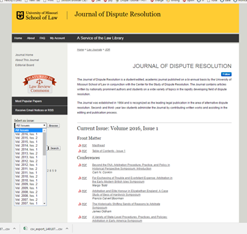
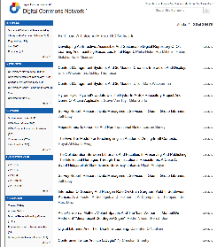
http://scholarship.law.missouri.edu/jdr/
Digital Commons at University of Missouri Law School
...
Like the drop down box from which users can choose an issue. Once an issue is chosen, the pdfs are organized under categories - which vary from issue to issue
Examples:
- Front matter
- Conferences
- Notes
...
...
...
...
Focus on institucional Repository context
Image highlight, general stats, last deposits, administrative information regarding the repository use
...
...
...
...
...
...
...
...
Figshare clearly takes the angle that the actual file/pdf is the most important thing the user wants. Above the fold, they only show the file (rendered), with an option to download below.
You have to scroll below the fold to get to the metadata.
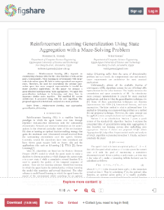
. The overall goal is that DSpace 7 will represent "the best of both worlds" when it comes to unifying XMLUI and JSPUI.
But if BOTH JSPUI and XMLUI are lacking in important areas, we're also looking outwards to other systems to see how we can pick low hanging improvement fruit.
UI Aspects visible on EVERY PAGES
This includes headers, footers and navs (IF navs are present everywhere)
Essential features / Links to use cases
...
Examples
Homepage
Essential features / Links to use cases
...
Examples
| Screen shot & Source URL | Individual observations | Joint community opinion |
|---|---|---|
Main pane
Right nav
| ||
News => KEEP Community listing + Discover facets next to eachothers
| ||
DSpace-CRIS out-of-box and typical "customization"
|
Typically insitutions use the html editable section to put
| |
Homepage with animated "carousel" / "discovery thingy" |
| 2017 June 7 interesting but not enthusiastic about this viewer |
simple but powerful works for all types of content and repos with mixed content. Princeton has for example no pretty images, lots of journal articles, ETDs, some datasets, ... low maintenance: no manual grooming of featured items - no worries that arithmetically chosen featured items step on anybodies feelings this will live and die with the SEARCH and Filter capabilities on the search results page
| 2017 June 7 would be a very good customizable option | |
| 2017 June 7 like how it highlights new items like as an option, but not a default would like it customizable | |
Felicity Dykas (Missouri) Dynamic map; dots appear to show items being downloaded. Eye-catching. Shows users (and administrators) that this is a site that is being used. "This map shows recent readership activitiy ..." | 2017 June 7 homepage should be simple; useful to have option to add to selected pages; e.g., statistics view; make available for repository, community, collection, and items nice, interactive feature shows records being accessed would be of interest to faculty | |
Felicity Dykas (Missouri) Slide show - as an option feature. Knowledge Bank at OSU has this feature: https://kb.osu.edu/dspace/ | 2017 June 6 Would like homepage design options that add appealing visuals | |
Focus on institucional Repository context Image highlight, general stats, last deposits, administrative information regarding the repository use | ||
Institutional repository with banner slideshow of the institution + action buttons to deposit, login,.. + information regarding policy, helpdesk... |


Item Listing & Search Results Page
Is search results & item listing completely the same or should we have different designs?
In other words, are there different requirements for let's say, listing items in a "Recently Added" list or a "Browse By" list, compared to how they should be listed as search results?
Essential features / Links to use cases
...
Examples
| Screen shot and Source URL | Individual observations | Joint community opinion |
|---|---|---|
| 2017 June 7 would like display of the pdf as a customizable option for collections and search results takes up a lot of the screen, reducing space for side bars | |
LIKE
DISLIKE
NOT SURE
| 2017 June 7 busy | |
| ||
Felicity Dykas (Missouri) Different options for viewing search results:
Users get to choose; plus manager can set default. I like how the metadata is displayed in the List view. Clearly labeled and simple. | 2017 June 6 Like ability to offer users different view options: condensed/expanded, and the options here Not sure if users use such options | |
Simple and clean with the possibility to refine search | ||
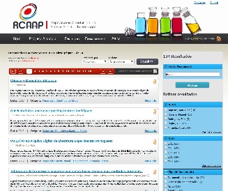
https://www.rcaap.pt/ (search for "DSpace") | List of items with preview of abstract, type of access, date... + possibility to filter results | |
LIKE
DISLIKE
NOT SURE
| ||
DISLIKE
|


Item page
Essential features / Links to use cases
...
Examples
| Screen Shot and source URL | Individual observations | Joint Community Opinion |
|---|---|---|
| ||
So much awesomeness don't know where to begin | ||
Felicity Dykas (Missouri) Like the drop down box from which users can choose an issue. Once an issue is chosen, the pdfs are organized under categories - which vary from issue to issue Examples:
| ||
Figshare clearly takes the angle that the actual file/pdf is the most important thing the user wants. Above the fold, they only show the file (rendered), with an option to download below. You have to scroll below the fold to get to the metadata. |

Submission forms
Essential features / Links to use cases
Submitters should not lose information: explicit or implicit saving
Compatible with the current definition of input-forms.xml, meaning that:
- Different form configurations per collection should remain supported
- Type-bind showing of particular fields should remain supported
Examples
| Screen shot and source URL | Individual Observations | Joint community opinion |
|---|---|---|
| Standard DSpace 6 XMLUI submission forms | ||
Standard DSpace 6 JSPUI submission forms |
Community page, Collection page, overview
Because a community in DSpace can have many subcommunities, every community can be a tree in itself.
So the challenge to represent ONE community (and its sub communities) is actually very similar to representing ALL top level communities.
Essential features / Links to use cases
...
Examples
| Screen shot & Source URL | Individual Observations | Joint Community Opinion |
|---|---|---|
Felicity Dykas (Missouri): Like the drop down box from which users can choose an issue. Once an issue is chosen, the pdfs are organized under categories - which vary from issue to issue Examples:
| ||
Arthur Smith: Simple categories, visually easy to browse. |
Author profile
Author profiles are NOT a default feature of DSpace 6 JSPUI or XMLUI. Maybe we should remove this section as a whole, if we're not adding author profiles in DSpace 7.
Essential features / Links to use cases
...
Examples
| Screen shot and source URL | Individual Observations | Joint community opinion |
|---|---|---|
Bram Luyten (Atmire): So much awesomeness don't know where to begin |
...
...
...
LIKE
- bibliography export option
DISLIKE
- the UI design in general
...
...
LIKE
- direct file downloads from search results
- facet values limited to 5
DISLIKE
- Not responsive
- "Publication" field => not sure if the host publication is important enough to show it in the SERP
- Authors are not clickable
NOT SURE
- Saved searches. Requires creating an account. Why show the button if you need to be logged in to use it?
...
...
Simple Search
...
...
DISLIKE
- Authors are hard to distinguish from titles
- No direct file downloads
- Too little information in SERP entries
Author profile
...
...
Homepage with animated "carousel" / "discovery thingy"
Example of an "item page" in this system
...
- Visually eye catching section that draws the user to recent/highlighted content
- In a DSpace context, this could be the thumbnails of recent items, or highlighted items/collections
- In a DSpace context, this could be the thumbnails of recent items, or highlighted items/collections
- Search box that could also function to show the user the (top level) communities. The fact that the box does search "everywhere" by default, but allows you to drill down to a particular topic/community is very nice
- The SEARCH feature & listing of search results seems TOO LIGHT. Only sorting between relevance and name. No facets. I'm convinced we still need facets in DSpace search. Although there's something to say for simplicity as well.
- The item page equivalent seems a little "light". It's interesting that you lose all context of navigation, no breadcrumb etc. User is supposed to use the back button? It's very clean, but maybe too clean (e.g. sacrificing usability?)
- The fact that a single item can have its own header to make it more visual is really nice.
...
2017 June 7
interesting but not enthusiastic about this viewer
...
...
...
simple but powerful
works for all types of content and repos with mixed content. Princeton has for example no pretty images, lots of journal articles, ETDs, some datasets, ...
low maintenance: no manual grooming of featured items - no worries that arithmetically chosen featured items step on anybodies feelings
this will live and die with the SEARCH and Filter capabilities on the search results page
- SEARCH could lead to a page that shows a list of results and offers categories to filter results; categories should be configurable: eg
- DataSet → show only dc.type = DataSet matches
- Department → show local.custom.department facet to select one or more choices
- in terms of filtering: draw inspiration from what Blacklight does - or look at WOS search page or ....
- the grid up top could lead to a hamburger style menu - collections, submission instructions, news, statistics, ....
- top right Login or User Logo
...
2017 June 7
would be a very good customizable option
...
...
- CONTENT FIRST
- Left panel: emphasis on recent/highlighted items.
- Right panel: collections/communities/subjects
- BELOW: explanation about the system/repository
- NO SIDEBAR/Clutter left or right
- Focus on social in the top level bar
2017 June 7
like how it highlights new items
like as an option, but not a default
would like it customizable
...
...
- Great on mobile
- Title, citation, abstract and PDF icon
- Nothing screams "download me" more than a PDF icon
...
2017 June 7
would like display of the pdf as a customizable option for collections and search results
takes up a lot of the screen, reducing space for side bars
...
...
...
LIKE
- Each item in the list has an extensive listing, with room for an image/banner per paper.
DISLIKE
- If you need +10% of your vertical space to explain how the interface works, is it a good interface?
- Discovery aids are limited to a search box and a tag cloud
NOT SURE
- Titel, Author, Abstract, Date, Citation and view link to the publisher page are the key metadata being shown.
2017 June 7
busy
...
...
- Facets fold in. Nice approach to ensure that the list of facets doesn't become too long
- Publication year slider with horizontal bar visualisation of how many results are available per year.
...
...
...
So much awesomeness don't know where to begin
...
...
Digital Commons at Missouri University of Science and Technology
Dynamic map; dots appear to show items being downloaded. Eye-catching. Shows users (and administrators) that this is a site that is being used.
"This map shows recent readership activitiy ..."
2017 June 7
homepage should be simple; useful to have option to add to selected pages; e.g., statistics view; make available for repository, community, collection, and items
nice, interactive feature
shows records being accessed
would be of interest to faculty
...
https://dl.mospace.umsystem.edu/umsl/
Islandora at University of Missouri–St. Louis
Slide show - as an option feature.
Knowledge Bank at OSU has this feature: https://kb.osu.edu/dspace/
...
2017 June 6
Would like homepage design options that add appealing visuals
...
...
https://ir.uwf.edu/islandora/search/education?type=dismax
U of West Florida
...
Different options for viewing search results:
- List
- Grid
- Table
Users get to choose; plus manager can set default.
I like how the metadata is displayed in the List view. Clearly labeled and simple.
2017 June 6
Like ability to offer users different view options: condensed/expanded, and the options here
Not sure if users use such options
...
http://scholarship.law.missouri.edu/jdr/
Digital Commons at University of Missouri Law School
...
Like the drop down box from which users can choose an issue. Once an issue is chosen, the pdfs are organized under categories - which vary from issue to issue
Examples:
- Front matter
- Conferences
- Notes
...
...
...
...
Focus on institucional Repository context
Image highlight, general stats, last deposits, administrative information regarding the repository use
...
...
...
...
...
...
...
...
Figshare clearly takes the angle that the actual file/pdf is the most important thing the user wants. Above the fold, they only show the file (rendered), with an option to download below.
You have to scroll below the fold to get to the metadata.
...
...
...
LIKE
- bibliography export option
DISLIKE
- the UI design in general
...
...
LIKE
- direct file downloads from search results
- facet values limited to 5
DISLIKE
- Not responsive
- "Publication" field => not sure if the host publication is important enough to show it in the SERP
- Authors are not clickable
NOT SURE
- Saved searches. Requires creating an account. Why show the button if you need to be logged in to use it?
...
...
Simple Search
...
...
DISLIKE
- Authors are hard to distinguish from titles
- No direct file downloads
- Too little information in SERP entries
...
Overview
Content Tools