Introduction
This is a summary of the an usability report of our DSpace-based Institutional Repository made by a . It's been done by Remei Quero, a librarian and student from Universitat de Lleida, for her master's dissertation (Master's Degree in Human-Computer Interaction. Escola Politècnica Superior).
At the time the usability study was done, our repository was set up with a customised JSPUI. As XMLUI is the interface were more development effort has seen recently and, therefore more polished, I decided to deliberatively omit problems found in JPSUI not applicable to XMLUI while writing this summary. Problems specific to our customisations are omitted too.
Participants
Fifteen participants were recruited, five from each group in the university: Research and Teaching Staff, students and Administrative Staff.
All of them had a minimum knowledge of the search utilities the Library Service provides to search through the different resources it has. They also were used to search information in the Internet. However, most of them hadn't never used the repository or didn't even know about it.
Methodology
The participants were asked to perform the following five tasks while thinking aloud:
...
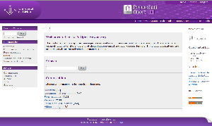
The test was run with our repository, which at the time, was set up with a customised JSPUI over a DSpace 1.5.2 as seen in the screen shot bellow:
The main structural changes most significant customisations we made to the page structure were:
- Some of the elements from the navigation bar were moved to a stripe in the header.
- A box with the top level communities was added to the navigation bar.
Findings
Searching
Participants found it confusing to have two search boxes in the home page. They also complained the boxes were too small. One participant was not sure whether he could type in multiple words or only one. Another participant did not know he could type into the search box.
When the search results are presented they would like to know the kind of document (e.g. article, conference, thesis, etc.). They also complained about the quality of the search results. Although they tried refining the search adding more terms, the items they were looking for didn't appear at the top of the list.
...
- Remove the search box from the left bar in the home page and add the "Advanced Search" link to the one in the centre. In the rest of the pages show only the search box in the left bar.
- Add some hint text in the search boxes like "Type in some words to search".
- Make search boxes bigger.
Opening
...
Documents
Participants were asked to search for a document and open it. Most of them, after arriving at the item visualization page, go went directly to the link of the URI field. After several attempts , they realise realised their mistake and then they finally go went to the files section.
Browsing Communities and Collections
Participants expected a list in the centre of the page with items from the current community or collection, like the one shown when clicking on the brows browse by title link. They were confused and thought there were no items in the collection.
...
- Instead having a recent submissions list which can make users think it's listing all the items in the community/collection, replace it with a paged list with all items.
Registering as a
...
New User
When participants received the e-mail email to complete the registration they found it weird that the sender was a person (they saw my e-mail email address, which is the one we have set as the admin mail), they would rather expect it from the repository.
Recommendations:
- Send the registration e-mail email with the name of the repository as the sender, regardless of the admin address set in the configuration. For example, set the sender to "University of Lleida's Repository" instead of "someone@udl.cat".
Email Subscriptions
Participants didn't find it useful to subscribe to collections. Instead, they would like to subscribe to subjects (the ones from dc.subject) as it would allow them to specify more precisely what they are interested in.
Looking for Help
Sometimes participants got lost and looked for help, but they didn't find it very useful. They commented there was too much information and that it should be improved.
In XMLUI it's even worse as there is no help system at all.
Terminology
Participants didn't know what some terms like "community" or "collections" were referring to. They commented they were too general.
...
They also didn't understand the meaning of terms like URL, URI, RSS, DSpace, etc.
Communities and Collections Structure
Although it is not directly related to usability of DSpace, I think people working on repositories will find it useful when they face the task of building an a structure of Communities and collections for their repository.
Our repository's communities and collections are more or less structured in the way of thinking of the librarians and the way the university is structured. For example, we have a top level community "Research" broken into departments and finally on the type of document. However, participants didn't find it very useful. They commented they would rather structure it in subjects/areas of knowledge, from more general to more specific.
Comments and Suggestions
Some participants made comments or suggestions for the repository:
- Allow to send links to items by mail. We would rather add the typical widget that, apart from this, also allows to share links in social networks or popular webs.
- They would like to be able to subscribe to RSS feeds through a cloud tag of subjects.
- Add a link to an explanation of what a RSS feed is as many people don't know about them.
- Add a widget to increase the font size (the typical
Span style font-size:small; A Span style font-size:medium; A
).Span style font-size:large; A
